Nauticrawl
UX design of a roguelike inside a cockpit sim
As I'm squeezing the last couple of levers in the cluttered cockpit of Nauticrawl, my roguelike within a cockpit sim, I decided to use this as an excuse to share some thoughts on what it's like to design a user experience around physical controls rather than 2D abstract elements.
So far the game relied on the keyboard WASD keys to move and rotate the vehicle around, there were no physical controls in the cockpit. 
But during beta testing it's been noted that not having physical controls just for the movement will break the immersion and also block those that don't realize keyboard mappings are there, which makes total sense, so lets get to it.
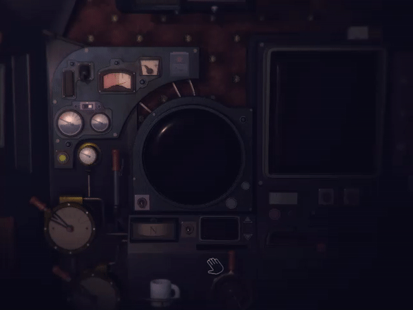
Nauticrawl does not have any 2D heads up display at all, and as I've been recently told on twitter, this type of interface is referred to as "diegetic".
From wikipedia:
In video games "diegesis" comprises the narrative game world, its characters, objects and actions which can be classified as "intra-diegetic".
Status icons, menu bars and other UI which are not part of the game world itself can be considered as "extra-diegetic".
In other words, Nauticrawl's user interface is also the world in which you play the game, sounds cool 8 )
Unfortunately, it also means that every time I need to add something new to this user interface, I have no automatic tools to make room for new stuff, so I might easily get stuck somewhere along the line if the layout of controls are in need of a big change.
Here you can see an example of my very accurate design plan, it looks like this time I got lucky and there is enough space right where I needed it.
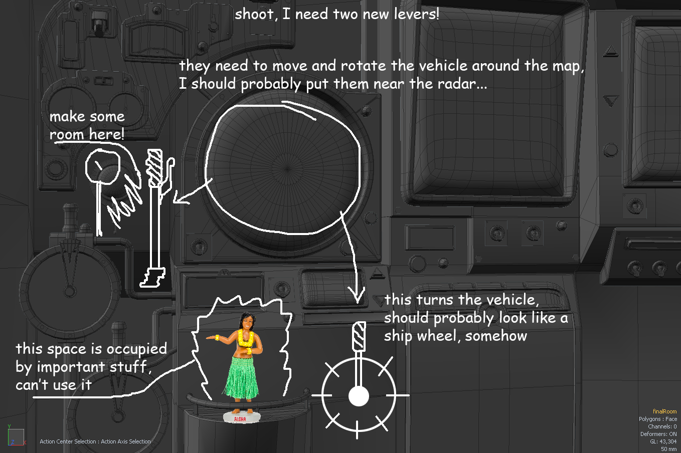
Now that I have a clear enough "plan", I can start modeling the new controls, but before I do that I need to also think about the clues I will give away on what this new levers will do, and that's because this user interface has no guide or tutorial at all.
Without a tutorial the user experience becomes a puzzle, so the cockpit has to be made in a way that gives some visual clues and consistency, but also force the player to experiment in order to figure things out.
Placing the levers around the radar is the first clue I can give the player that these levers might have something to do with moving the vehicle around the map.
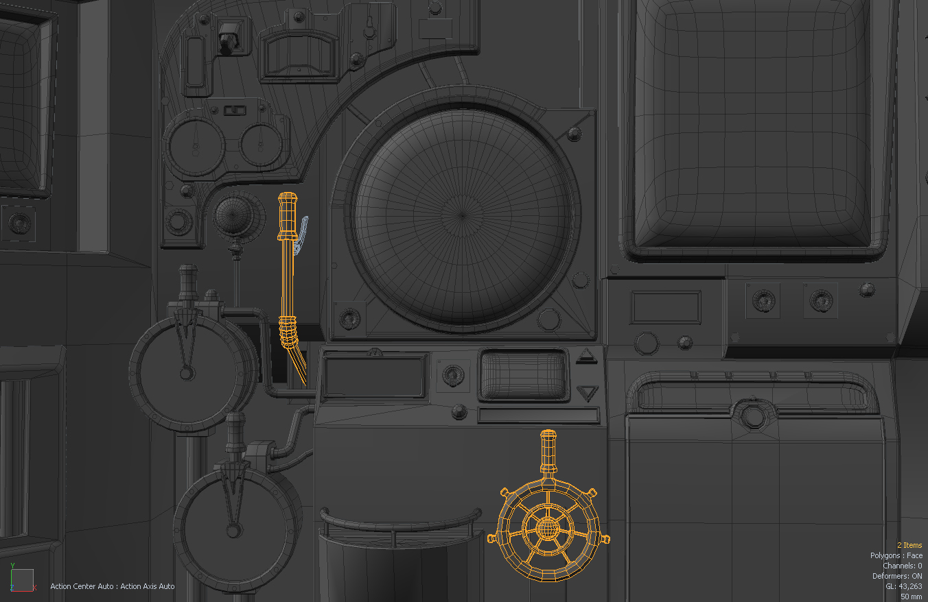
Another clue has been given by modeling one of the levers as a ship-wheel, even though it works as a simple pull lever going left or right.
As for the reason why the steering control is a pull lever as opposed to a spin wheel, it just requires less mouse action this way, but I might still change that later on.
Aside from spacial meaning and shape, I also try and keeping a consistent visual language with the materials.
I gave the same leather material to all the levers that have something to do with moving the vehicle, and I've also added a slightly emissive value to always keep them sticking out of the shadows. You don't want to die because you couldn't see the movement lever, there's enough ways to die in this game already!
The rest is about coding and it's actually where things finally get easy and reusable, with each control sharing a base implementation to handle mouse and contact, I can simply add a bounding box and either use a component I already made or write a few lines of code and make a new one in a few minutes.
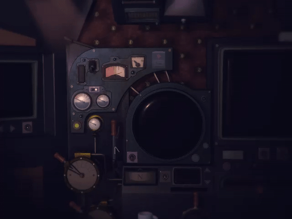
That's it, levers done! And even though they are only useful while the player is trying to figure out how to move the machine, they serve the important purpose of allowing a smooth transition from mouse to keyboard bindings once the game's focus shits onto exploring the world map.
They might come in handy again for future ports though (cough, touch screens, cough).
Comments
Log in with itch.io to leave a comment.
I appreciate a good ux breakdown like this post.
I'd like to suggest to things as this interface is completely diegetic
1. Natural wear and tear on lever handles that are used the most frequently - this might give the player more intuitive clues
2. levelers can cause wear and tear on the metal surface they rest on
https://i.imgur.com/Kskmu2q.png
Interesting problem space you've created for yourself with this game. I like how you're putting so much thought into the UX. But I noticed that in the last screenshots you posted that the steering wheel seems to be in shadow and is actually kind of hard to see. Is it easier to spot in the actual game?
Good observation, yes, once you start switching on the battery and then the monitors the light in the cockpit starts showing up the controls in the shadow.
Indeed, the game opposes a whole lot of interesting isssues that had to be solved, lots of fun and a very interesting experience.
Ah. Very cool. I'm looking forward to seeing it in action.
Can't wait to play this beauty.